Mobile-first school discovery platform
Thrive School Guide is a comprehensive platform designed to help parents make informed decisions about their children’s education. I led the design of the mobile experience, focusing on creating a clear, accessible, and intuitive way to explore, compare, and evaluate schools on the go.

Research
The research phase focused on understanding how parents search for schools and the challenges they face when evaluating options. Through user insights and market analysis, it became clear that information is often fragmented, difficult to compare, and lacks transparency. Parents needed a reliable, centralized source that combines academic performance, social environment, and real community feedback to support confident decision-making.
Define
Based on these insights, the core challenge was defined: design a platform that simplifies the school selection process by organizing complex information into a clear, accessible, and comparable experience. The solution needed to balance data-driven insights with human perspectives, allowing parents to evaluate schools not only by performance, but also by environment, safety, and community values.
Prototype
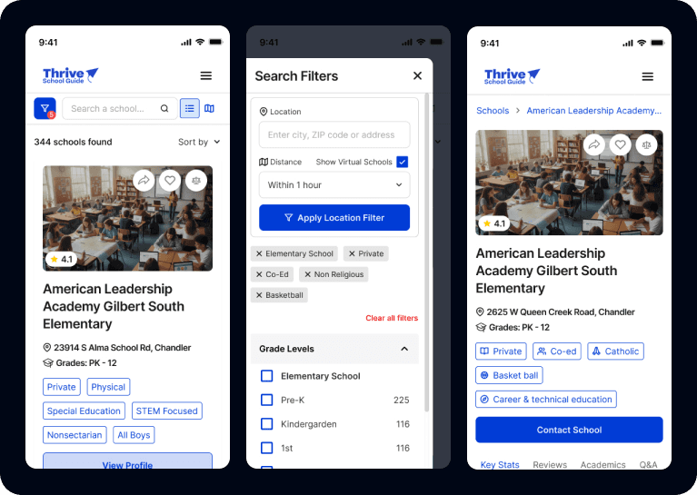
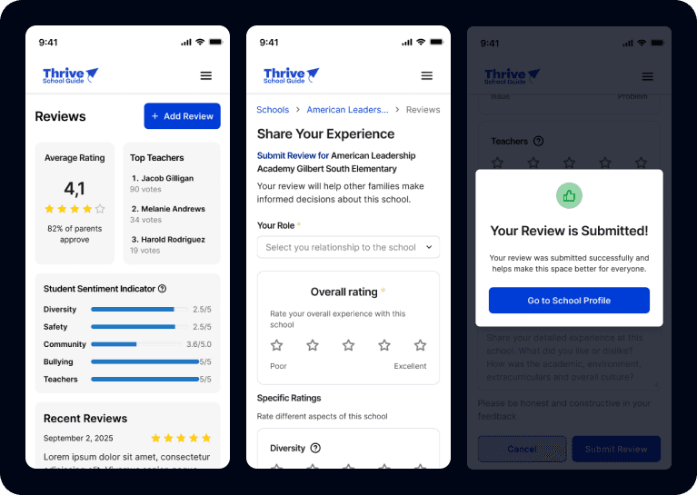
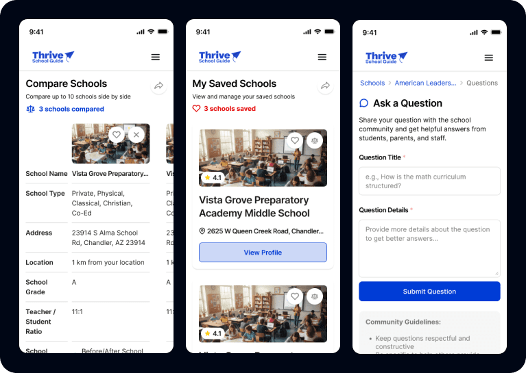
The platform was designed as an intuitive and scalable search experience, allowing users to explore and compare schools through advanced filters and detailed profiles. Each school page highlights key metrics such as academic performance, safety ratings, diversity, and teacher quality, alongside reviews and community-driven insights. The design prioritizes clarity, easy comparison, and a seamless navigation flow to support confident decision-making.
My Role
Competitive research and benchmark analysis of educational platforms
Selection of best UX practices alongside the product team
Mobile UI Design
Design System creation aligned with K12’s existing ecosystem
Iteration of user experiences based on stakeholder and team feedback
Responsive behavior and interaction refinement
Problem Solved
Parents were struggling to efficiently compare schools due to scattered information, excessive navigation steps, and a lack of clear decision-making tools within the platform.
The redesign focused on reducing friction by simplifying the navigation structure, improving content hierarchy, and introducing filtering systems, reviews, and question-based interactions that allowed users to find relevant schools faster and with greater confidence.

Impact
Improved user retention through a clearer and more engaging mobile experience
Reduced the number of clicks required to discover and compare schools
Enhanced decision-making for parents through structured filters, reviews, and community-driven insights
Increased usability and accessibility by improving content organization and navigation flow
Created a scalable mobile design system aligned with K12’s product ecosystem


